Last modified 2026-01-23 |
Explore Data Apps Plugins and Other UI Components
At a Glance
Data Apps is a dynamic platform that showcases the data and computational resources in HISE, helps scientists explore AIFI research, awards Certificates of Reproducibility, and packages assets in a custom-designed UI. After publication of your Data App, a HISE administrator will work with you to set up a workspace in which you can use the Django content management system (CMS) to create a navigation menu and a set of web pages to spotlight your Data App. If you have questions, contact Support .
Content Management System
Django CMS is an open-source tool built on the Django web framework. The drag-and-drop Django interface helps you organize pages, add content, and customize the UI for your Data Apps website. For details, see Manage Pages and Text Elements in the Data Apps UI (Tutorial).
Page Templates
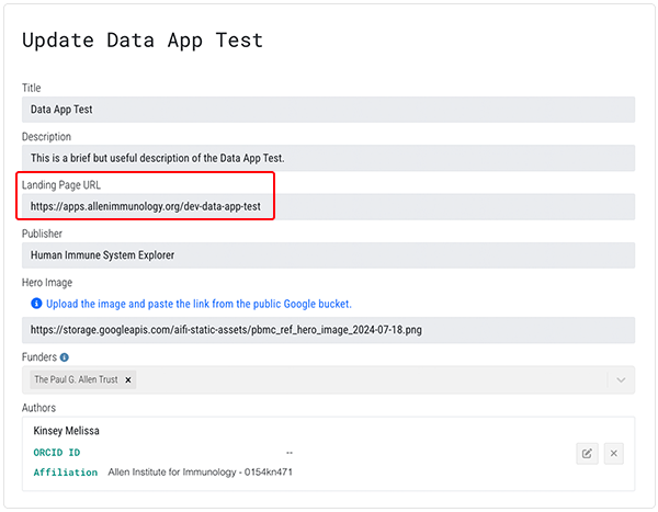
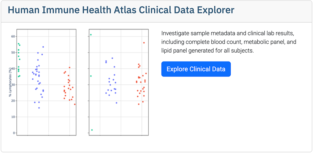
When your Data App is approved, you can access its landing page. The URL is listed in the Landing Page URL field on the Update page of your Data App:
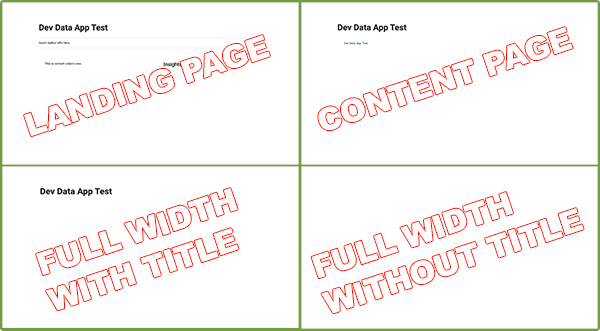
The accompanying image shows the landing page and the three other available Data Apps templates.
Plugins
The Data Apps UI uses a set of plugins to organize and present text content and visual elements. If you've used Bootstrap, these plugins might look familiar. If you haven't, don't worry—no coding experience or other prior knowledge is necessary. The recommended Data Apps plugins for visual elements are summarized in following table.
Plugin | Description | Selected variations | Example |
TEXT CONTAINERS |
|
|
|
Text | Text content | Type or paste content and use Django's integrated heading styles or other styling tools | Text Content |
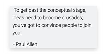
Blockquote | Container to highlight a specified quotation |
|
|
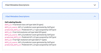
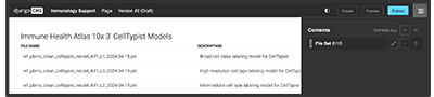
Accordion | Heading that slides open to reveal boxed content, such as further details, tabular material, or downloadable files |
| The image below shows a one-item accordion element closed and open.
|
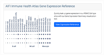
Card | Container for text, images, and other content |
|
|
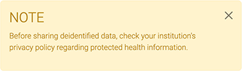
Alert | Container to highlight specified information |
|
|
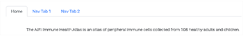
Tabs | Component for organizing text content | Tab size, color, shape, and placement can be styled as desired |
|
BUTTONS & BADGES |
|
|
|
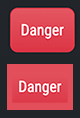
Button | Visual element that performs an action, especially within a form or dialog box |
|
|
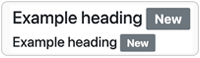
Badge | Label used to create a tag (see far right column, top). |
|
Cited 9 |
DATA ELEMENTS |
|
|
|
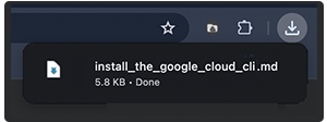
File | Text link to a downloadable file | Accepts |
|
File set | Use GUIDs of Data App and file set to import file set data | None |
|
VISUAL ELEMENTS |
|
|
|
Picture/Image | Static visual element, such as a PNG or JPG file | Ranges from a screenshot or decorative element to a hero image or detailed visualization |
|
Jumbotron | Container for hero image |
|
|
Carousel | Dynamic image viewer |
|
|
Video | Link to a YouTube video or other dynamic visual element | Use | |
Icon | Place selected Font Awesome icons | Use visual cues, such as this file icon, or decorative icons, such as this microscope icon |
|
OTHER |
|
|
|
Code | Code content |
|
|
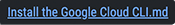
Link | Inline URLs that direct the user to other pages or resources | URLs can point to internal or external web addresses |


Primary | Secondary | Success | Danger | Warning | Info | Light | Dark |
 Related Resources
Explore the Data Apps Platform
Get Started with Data Apps (Tutorial)
Request Approval for Data Apps (Tutorial)
Manage Pages and Text Elements in the Data Apps UI (Tutorial)
Manage Visual and Navigational Elements in the Data Apps UI (Tutorial)