Manage Visual and Navigational Elements in the Data Apps UI (Tutorial)
 | Abbreviations Key |
| AIFI | Allen Institute for Immunology |
| CMS | content management system |
| HISE | Human Immune System Explorer |
| ms | milliseconds |
| px | pixels |
| sec | seconds |
| UI | user interface |
At a Glance
Data Apps is a dynamic platform that showcases the data and computational resources in HISE, helps scientists explore AIFI research, awards Certificates of Reproducibility, and packages assets in a custom-designed UI. After publication of your Data App, you can create a workspace to add your content, such as a navigation menu, pages, and visualizations. For details, see Manage Workspaces (Tutorial).
This document explains step by step how to add the following plugins in the Data Apps UI:
Navigational Elements
Visual Elements
To create pages or text containers (including some with visual elements, such as cards) see Manage Pages and Text Elements in the Data Apps UI (Tutorial). To work with data elements, see Manage Files and Code in the Data Apps UI (Tutorial). |
Instructions for Navigational Elements
Add a button
A button is a visual element that performs an action. For details, see the Button section of Explore Data Apps Plugins and Other UI Components.
1. Navigate to the Data Apps CMS admin site, click External Docs, and click on the page and section you want to edit. For details, see Manage Pages and Text Elements in the Data Apps UI (Tutorial).
2. Click the plus (+) sign.
3. From the drop-down list, choose Link/Button.

4. In the Type field, select Button.
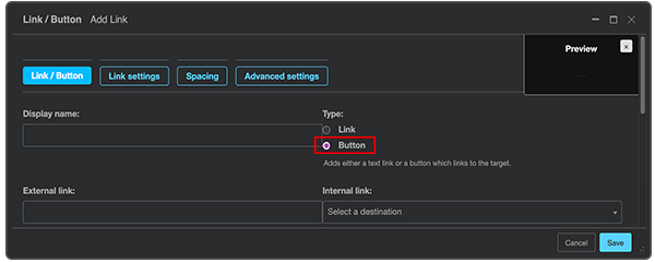
5. In the Display name field, type the text to appear on the button (in this case, Read More).

6. Link buttons:
A. Option A: In the External link field, paste a link, and click Save.
B. Option B: In the Internal link field, scroll to find the page you want to link, and then click Save. (To narrow your choices, type a few letters of the page title into the text field and then click on your selection.)
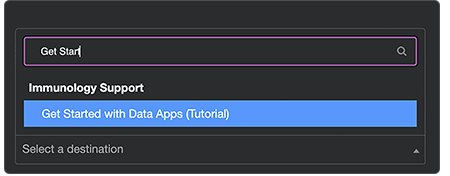
7. In the Context field, choose a color. (Alternatively, use Advanced settings to apply your preferred background color.)
8. In the Button size field, choose Small, Medium, or Large.
9. (Optional) Use Advanced settings to apply your preferred styles (shape, color, size, border, typeface, font characteristics, and so on). (The nonworking buttons shown here are for example only.)

10. (Optional) Add space around or within your buttons:
A. Add space between buttons:
i. In the Link/Button dialog box, click Spacing.
ii.In the Horizontal margins field, click the arrow.
iii. From the drop-down list, choose the amount of space you want to add (.25 in this example).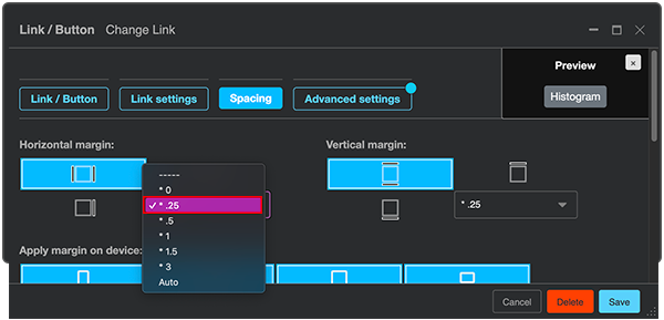
iv. Click Save. (The nonworking buttons shown here are for example only.)

B. Add space above or below buttons:
i. In the Link/Button dialog box, click Spacing.
ii.Click the arrow in the Vertical margins field.
iii. From the drop-down list, choose the amount of space you want to add.
iv. Click Save.
C. Add padding around the text within your buttons:
i. In the Link/Button dialog box, click Spacing.
ii.Scroll down to the Padding section.
iii. In the Horizontal padding field, click the arrow.
iv. From the drop-down list, choose the amount of space you want to add (in this case, 1).
v. In the Vertical padding field, click the arrow.
vi. From the drop-down list, add the same amount of space you used for the horizontal padding (recommended).
vii. Click Save. (The nonworking buttons shown here are for example only.)

Add a link
Links direct users to other pages or resources. For details, see the Link section of of Explore Data Apps Plugins and Other UI Components.
1. Navigate to the Data Apps CMS admin site, click External Docs, and click on the page and section you want to edit. For details, see Manage Pages and Text Elements in the Data Apps UI (Tutorial).
2. Click the plus (+) sign.
3. From the drop-down list, choose Link/Button.

4. In the Type field, select Link.
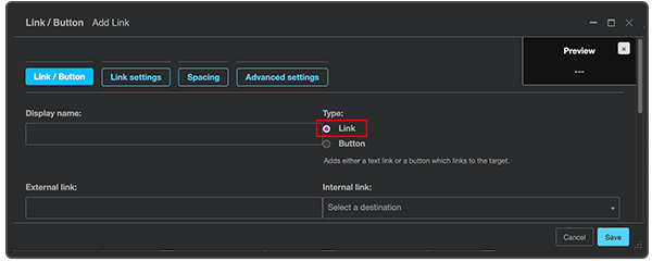
5. In the Display name field, type the text of the link (in this case, View Certificate of Reproducibility).

6. Make the link live:
A. Option A: In the External link field, paste a link, and click Save.
B. Option B: In the Internal link field, scroll to find the page you want to link to, and then click Save. (To narrow your choices, type a few letters of the page title into the text field and then click on your selection.)
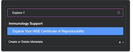
7. (Optional) In the Link/Button dialog box, use Advanced settings to apply your preferred styles.
View Certificate of Reproducibility
Add a badge
A badge is a label used to create a tag. For details, see the Badge section of Explore Data Apps Plugins and Other UI Components.
1. Navigate to the Data Apps CMS admin site, click External Docs, and click on the page and section you want to edit. For details, see Manage Pages and Text Elements in the Data Apps UI (Tutorial).
2. Click the plus (+) sign.
3. From the drop-down list, choose Badge.

4. In the Badge dialog box, enter your text into the Badge text field.
5. In the Context field, choose a color. (Alternatively, use Advanced settings to apply your preferred background color.)
6. (Optional) Create a capsule-shaped tag (such as the Published tag shown in Step 7) by selecting the checkbox next to Pills style in the Badge dialog box.

7. Click Save.

Instructions for Visual Elements
To increase visual interest and depict your data dynamically for your readers, you can add static or animated images to your publication or Data Apps page. To add any visual element, the first few steps are the same. Then choose the element you want to add, and follow the remaining instructions.
First steps for visual elements
1. Click the Toggle structure icon.

2. Click the plus (+) sign.
3. Follow the remaining instructions for the element you want to add.
Add an image
1. From the drop-down list, choose Picture/Image.

2. Click Choose File.
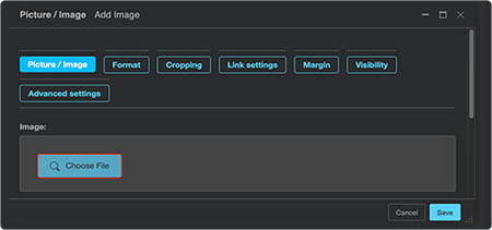
A. Upload a new image:
i. Click Upload Files.

ii. Browse for the image on your hard drive or in another file storage location, such as Google Drive or iCloud.
iii. To upload the image, click Open.
iv. Choose the image from the list of uploaded images, and click Save.
B. Use an existing image:
i. Click the folder icon at left and browse for the image you want to use.

ii. Click the image, and click Save.
Add a jumbotron
1. From the drop-down list, choose Jumbotron.

2. In the Content side panel, click the plus (+) sign to the right of the Jumbotron, and choose Picture/Image.
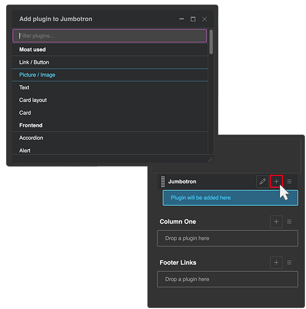
3. In the Picture/Image dialog box, click Choose file, and browse for the image you want to use.
4. Click Save.

Add an image carousel
1. From the drop-down list, choose Carousel.

2. In the Carousel dialog box, from the Aspect ratio field, click the arrow to select the image proportions from the drop-down list. Choose 1:1 for square images. Choose 21x9 or 18x9 for the best viewing experience on widescreen monitors. An aspect ratio of 3x2 or 4x3 is suitable for landscape-oriented images viewed on smaller devices.
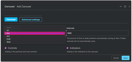
3. In the Interval field, either keep the default value of 5000 ms, (5 sec) or use the arrows to slow down or speed up (as in this case, to 3000 ms, or 3 sec) the rate at which images are rotated.
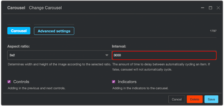
4. If you want the carousel to have Previous and Next arrows, as shown, keep the Controls checkbox selected. (The nonworking carousel shown here is for example only.)

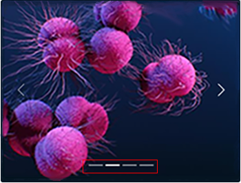
5. If you want the carousel to show the total number of images in the carousel, keep the Indicators checkbox selected. As the carousel rotates through the images, the current image is highlighted, as shown.
6. (Optional) To preserve image resolution, limit the width of your carousel:
i. In the Carousel dialog box, clck Advanced settings.
ii. Click the plus (+) sign.
iii. In the Attributes field, in the left text box, type style.
iv. In the right text box, type a size parameter, such as max-width:500px;.
7. Click Save.
Add a video
1. From the drop-down list, choose Video player.

2. On YouTube or elsewhere, find the video you want to use (in this case, "Inside the Human Immune System").
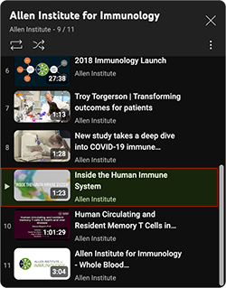
3. Hover your mouse over the right edge of the video, and click the vertical ellipsis.

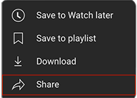
4. From the drop-down list, click Share.
5. To copy the embed code in the text field, click Copy.

6. Return to your Data Apps page. In the Video player dialog box, to the right of the Embed video field, click Show.
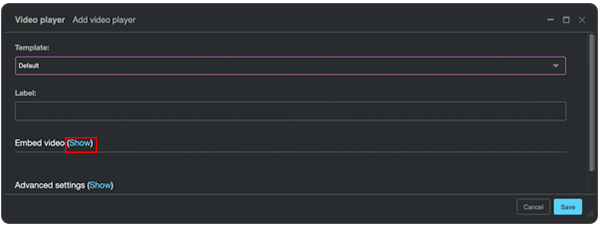
7. In the Embed link field, paste the video embed code.
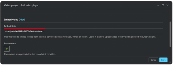
8. Click Save, and view the embedded video on your Data Apps page.

Add an icon
1. From the drop-down list, choose Icon.
![]()
2. Choose the type of Font Awesome 5 icon you want to use: Regular, Solid, or Brands (in this case, Solid).
![]()
3. Choose the specific icon you want
A. Option A: Find and select
i. Click the arrow to the right of the Icon field.
ii. Scroll to the icon you want, and click to select it.
iii. (Optional) In the Icon dialog box, in the Advanced settings section, click Show, and apply your preferred styles.
iv. Click Save.
B. Option B: Search
i. Click the arrow to the right of the icon field.
ii. In the text field, type a keyword that describes what you're looking for (in this case, eye) and click to select it.
![]()
iii. In the Icon dialog box, click OK.
iv. (Optional) In the Icon dialog box, in the Advanced settings section, click Show, and apply your preferred styles.
v. Click Save.
![]()
 Related Resources
Explore Data Apps Plugins and Other Components
Manage Pages and Text Elements in the Data Apps UI (Tutorial)
