
Manage Pages and Text Elements in the Data Apps UI (Tutorial)
| Abbreviations Key | |
| AIFI | Allen Institute for Immunology |
| CMS | content management system |
| HISE | Human Immune System Explorer |
| px | pixels |
| UI | user interface |
At a Glance
Data Apps is a dynamic platform that showcases the data and computational resources in HISE, helps scientists explore AIFI research, awards Certificates of Reproducibility, and packages assets in a custom-designed UI. After publication of your Data App, you can create a workspace to add your content, such as a navigation menu, pages, and visualizations. For details, see Manage Workspaces (Tutorial).
This document explains step by step how to create pages, use page templates, and use text and layout elements, including the following plugins:
For an introduction to all Data Apps UI elements, including plugins and templates, see Explore Data Apps Plugins and Other UI Components. To create navigational elements, such as buttons, badges, and links, and visual elements, including image carousels, embedded videos, and icons, see Manage Visual and Navigational Elements in the Data Apps UI (Tutorial). To attach files or format data, see Manage Files and Code in the Data Apps UI (Tutorial). |
Create Pages or Use Templates
Instructions
Add a page
1. Request a Data App, and note the URL of its landing page. For details, see Manage Workspaces (Tutorial).
2. Navigate to the Data Apps CMS admin site, and click External Docs.
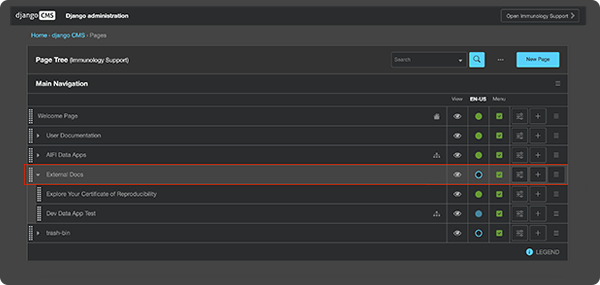
3. Click New Page.

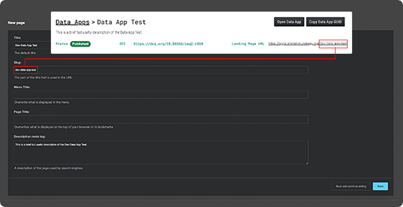
4. In the Add a page form, enter the title of your page. As you do so, a slug (the path to your page after the / at the end of the URL) is created automatically. This path (see screenshot below) must match the one shown in the landing page URL for your Data App (see inset within screenshot, top right). If necessary, overwrite the automatically created slug with one that matches the path to your landing page.
5. In the lower-right corner, click Save and continue editing.
6. In the upper-right corner, click View page on site.

7. In the upper-right corner of the top navigation menu, click Edit.

8. In the upper-right corner of the top navigation menu, click the Toggle structure icon.
![]()
9. Your new page is now ready for your content.
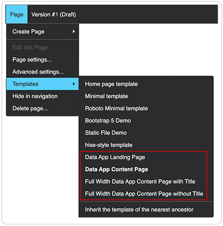
A. Alternative A: Use a page template. A template is a preconfigured page that has some plugins already in place (except for the "FULL WIDTH WITHOUT TITLE" template). Four Data Apps page templates are available:
- Landing page
- Content page
- Full width with title
- Full width without title
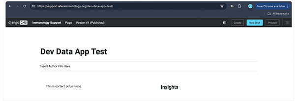
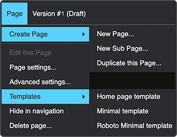
i. In the top navigation menu, click Page > Templates, and choose a template. For a preview, see the thumbnail images below.
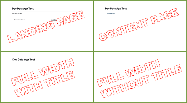
ii. Add content to your selected template. The title of your Data App is shown at the top of the page, and the page contains several placeholders. The landing page, for example, contains placeholders for the following content:
- Insert Author info here.
- This is content column one.
- Insights
B. Alternative B: Add plug-ins to the page. If you have experience building web pages, you probably don't need a template to get started. You can use plugins to build your pages directly and add exactly the content you want.
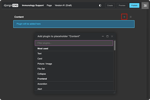
i. Click Edit > Toggle structure [an icon that looks like this:  ].
].
ii. Near the upper-right corner of your screen, click the plus (+) sign to see a list of available plugins. Most of these plugins are described in Explore Data Apps Plugins and Other UI Components and in the rest of this tutorial.
10. (Optional) Add a second or third page to your Data App:
A. In the upper-right corner, click New Draft.

B. From the top-left navigation menu, click Page.

C. From the drop-down list, choose either Create Page or Templates. Then select a new page or sub-page, a duplicate page, or a page template, according to your preference.
D. Click Save.
Use Headings
Instructions
Add a heading
You can add your heading as a separate Heading plugin or as formatted text within a Text plugin.
1. Add a heading plugin:
A. Click the Toggle structure icon.

B. Click the plus (+) sign.
C. From the drop-down list, choose Heading.

D. In the Heading dialog box, from the Heading level field, click the drop-down list and choose the heading level you want (in this case, Heading 2).
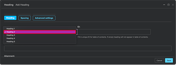
E. In the Heading dialog box, in the Heading field, type your heading (in this case, Microbial Genomics).
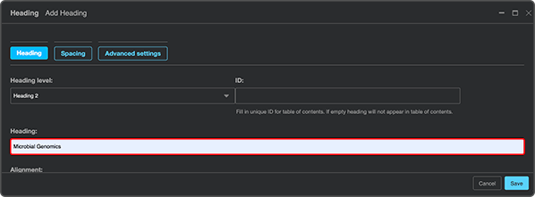
F. (Optional) Use Advanced settings to apply your preferred styles. See, for example, Step 4B in the Card section on this page.
G. Click Save.

2. Format text as a heading
A. Within a text container, type a heading.
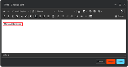
B. Highlight the text you just typed.
C. From the drop-down list of preformatted text options, choose the heading level you want.
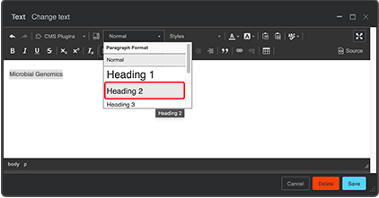
D. (Optional) Apply advanced formatting to your text.
i. Highlight your heading.
ii. Click, for example, the underlined A icon to change the text color.
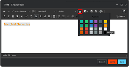
iii. Click Save.
Use Text Containers to Arrange Content
The Data Apps UI gives you several options for adding and arranging text content. You can place the content in paragraph form (text plugin), organize the material with tabs, add a blockquote, use an expanding text box (accordion plugin), highlight text on a card, or set up an alert to call attention to important information. Instructions follow for each of these elements.
Instructions
Add a text plugin
1. Click the Toggle structure icon.

2. Click the plus (+) sign.
3. From the drop-down list, choose Text.

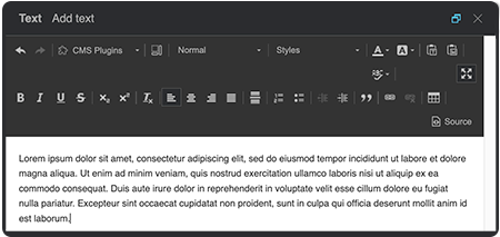
4. Type or paste your content, and use the on-screen formatting tools to apply headings, change the font size or color, create tables, and so on, according to your needs.
Add a blockquote
1. Click the Toggle structure icon.

2. Click the plus (+) sign.
3. From the drop-down list, choose Blockquote.

4. Add your content, and click Save.
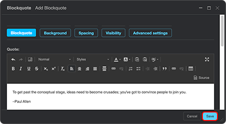
5. Click Background.
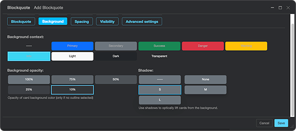
A. In the Background context field, choose a color, such as gray (Secondary).
B. In the Background opacity field, choose a percentage. For example, a 25% Secondary screen produces the medium-gray background you see in the finished example below (Step 5.D.iv).
C. In the Shadow field, choose whether you want a 3D shadow around your quotation box and, if so, how heavy it should be. The finished example has an S (small) shadow.
D. (Optional) Use Advanced settings to apply your preferred styles:
i. Click the plus (+) sign.
ii. In the left text field, type style.
iii. In the right text field, add specs for padding inside the quotation box, as in this example: padding: 15px;. You could also add other style elements of your choice, such as a margin for visual space between the box and surrounding text.
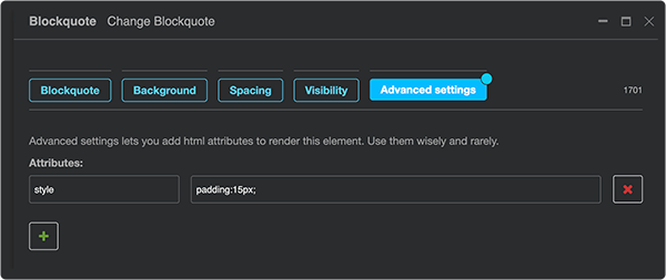
iv. Click Save, and view the finished quotation box in your Data App.


Add an expandable box (Accordion plugin)
1. Click the Toggle structure icon.

2. Click the plus (+) sign.
3. From the drop-down list, choose Accordion.

4. In the Accordion dialog box, follow these steps:
A. Click the arrow to the right of the Create accordion items field until you reach the number you want (in this case, 3).

B. Click Save.
5. To see the structure in the Content panel at right, click the arrow to the left of the Accordion plugin.
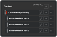
6. Add content to each accordion item:
A. Click the plus (+) sign.
B. Choose the Text plugin.
C. In the Text dialog box, type or paste your content, and click Save.
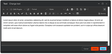
D. In the Content panel, click the Text plugin and drag it beneath an Accordion item.

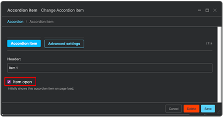
E. (Optional) To keep the first expandable box open by default, click the Accordion item plugin and select the checkbox next to Item open.
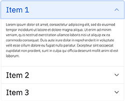
F. To view the finished Accordion element in your Data App, click Save.
Add a card
1. Click the Toggle structure icon.

2. Click the plus (+) sign.
3. From the drop-down list, choose Card.
4. To add content, click the plus (+) sign next to Card, and add the content of your choice, as in the example structure below:
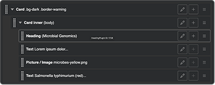
A. From the drop-down list, choose Card inner.
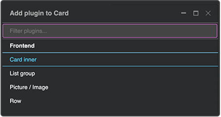
B. (Optional) Click the plus (+) sign to the right of Card inner, and add the content of your choice, as in this sample card:
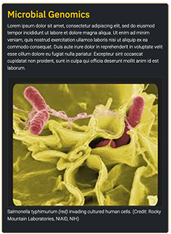
i. Add a Heading, and use Advanced settings to apply your preferred styles (to make the heading gold, for example, as in the finished card).
ii. Add a Text plugin.
iii. Add a Picture/Image plugin.
iv. To add a caption to your image, add a second Text plugin.
v. Add other content of your choice.
Add a set of cards
1. Click the Toggle structure icon.

2. Click the plus (+) sign.
3. From the drop-down list, choose Card layout.

4. In the Card layout dialog box:
A. In the Card type field, choose Grid cards.
B. In the Create cards field, click the arrow until you reach the number of cards you want (in this case, 4).
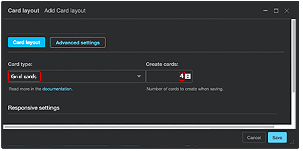
C. To view the Card layout structure in the side Content panel, click Save.
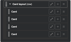
5. Add content to your cards:
A. On each card, click the plus (+) sign.
B. From the drop-down list, choose Card inner.

C. Click the plus (+) sign next to Card inner, and add the content of your choice, as in this example:
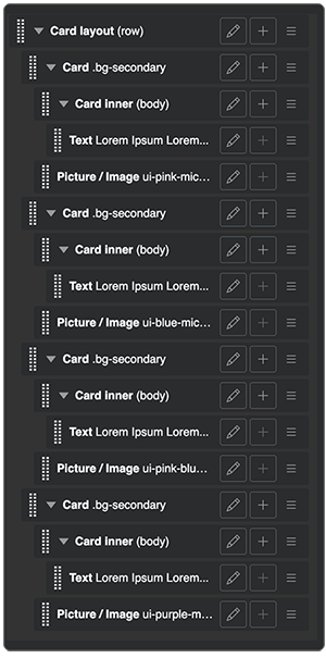
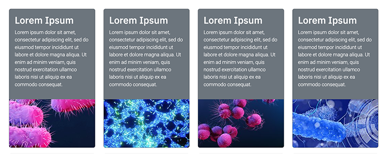
D. To view the finished card set, click Save. The first example corresponds to the structure outlined above.
Example 1: Card set
Example 2: Card set
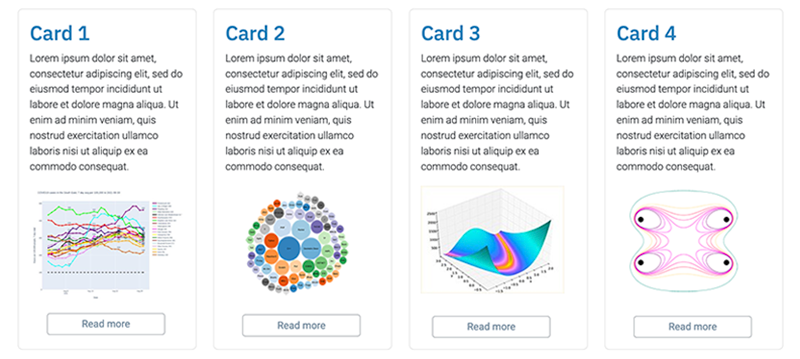
You can change the look of your cards in endless ways. Here are some ideas:
|
Add an alert
1. Click the Toggle structure icon.

2. Click the plus (+) sign.
3. From the drop-down list, choose Alert.

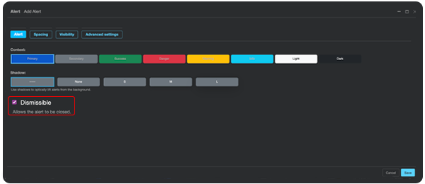
4. To let users close the box after they read the content, in the Alert dialog box, select the Dismissible checkbox.
5. (Optional) Use Advanced settings to apply your preferred styles.
6. Add content to the box:
A. In the Alert dialog box, click the plus (+) sign.

B. Choose the Text plugin.
C. Click Save.
D. In the Text dialog box, type or paste your content.
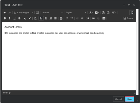
E. To view the finished Alert in your Data App, click Save. The X in ther upper-right corner of the box indicates that the notification is dismissible.

Add tabs
1. Click the Toggle structure icon.

2. Click the plus (+) sign.
3. From the drop-down list, choose Tabs.

4. In the Content side panel, click the plus (+) sign to the right of Tabs.
5. Choose the Tab item plugin.
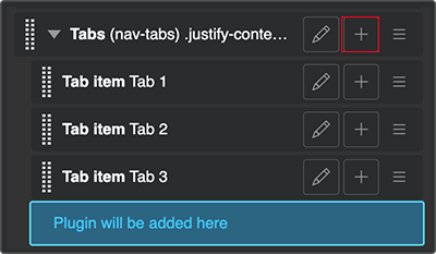
6. Repeat Steps 4 and 5 until you have the number of tabs you want.
7. (Optional) Use Advanced settings to apply your preferred styles:
A. To open the Advanced settings dialog box, click the pencil icon to the right of Tabs.
B. Apply your preferred styles, as shown in these finished examples.

C. Click Save.
8. Add content to your tabs:
A. Click the plus (+) sign to the right of each Tab item plugin.
B. Choose the Text plugin.
C. In the text window, type or paste your content.
D. Click Save.

 Related Resources